国外一名游戏从业人员对暴雪首席设计师、现任暴雪负责游戏开发的副总裁Rob Pardo(主要作品《星际争霸》、《魔兽争霸3》、《魔兽世界》等)在2006年GDC奥斯汀游戏大会现场所做的讲话进行了总结并发表纪要。Rob Pardo的演讲主题为“暴雪游戏设计之道”,他以大获成功的《魔兽世界》为例总结了暴雪在游戏设计上的一些准则。
魔兽世界堪称世界上最成功的网络游戏,不过最近几年里和一些国内的策划朋友聊天时,发现他们对于wow玩家(一般是指只玩过wow而没有玩过其他游戏的玩家)来应聘游戏策划都有很大的成见,他们认为这种人如果成为游戏策划将是一种灾难。这其中最主要的原因可能是这些受魔兽世界影响而希望成为策划、并制作出牛逼游戏的年轻人往往一叶障目,即便对于魔兽世界的了解也仅限于了解表象,不能领会魔兽世界成功的精髓,所以将这篇演讲纪要翻译出来并分享给国内的游戏策划和魔兽世界的玩家们,希望对你们有所帮助。
感谢楚云帆等同事本着分享的精神对原文进行了又一次的翻译和批注,转载请注明来源@新浪魔兽世界专区及作者。

我所要讲述的重点是:暴雪的游戏设计理念是如何贯彻在《魔兽世界》这一作品上的。
暴雪有一系列核心设计哲学,也有一些类似口头禅的设计原则,如:“专注特色”、“易于上手,难于精通”等等,在设计人员众多的团队里,拥有并贯彻这些共同的理念至关重要。
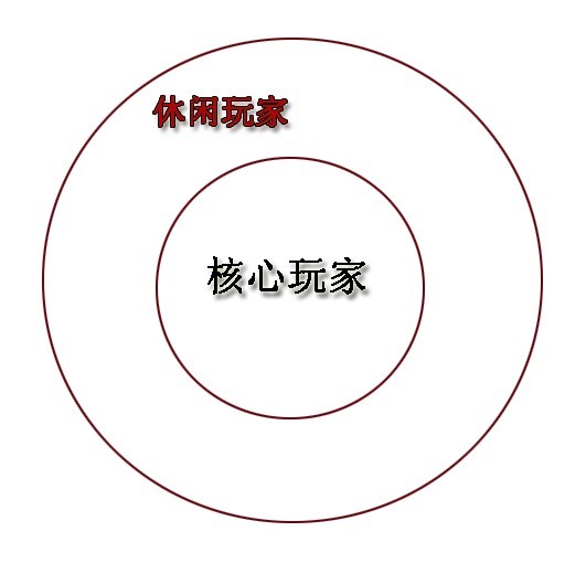
“万物始于圆”,暴雪的创始人之一Allan Adham习惯用一个同心圆来解释暴雪是如何进行玩家分类的。同心圆的内圈代表提供给核心玩家市场的游戏内容,而外圈的部分则对应休闲玩家市场,这两者虽然对于暴雪同样重要,但休闲玩家市场份额的增长速度要明显快于前者。区分这两种玩家的方法是其使用的电脑硬件配置。(译者注:别着急,后面我们会说到它和WOW的关系。)
“易于上手,难于精通” 是游戏设计的第一准则,我们会首先设计深度的内容,然后再调整其友好度。暴雪在开发游戏之初,会首先考虑通过做出非常牛B、最有意思的内容来增加游戏的生命周期,之后才会讨论关于游戏难度及用户习惯等问题--据我所知,许多游戏厂商在进行开发游戏时刚好相反。(译者注:国内游戏开发商大多先以用户习惯为主,而忽略了其游戏特色及游戏性。)
由于在MMO中受到职业系统影响最大的是游戏的战斗系统,所以在WOW开始讨论关于职业系统的设定时,我们会依据其战斗能力及特性来定位各个职业,并使他们尽量与其他职业不同。副本系统也一样,我们把它设计成只有组团才能进入,因为它是整个游戏最有趣最好玩的地方。副本是为高端玩家提供的游戏内容,也为小白/休闲玩家向高端/核心玩家提供过渡的桥梁。
暴雪在WOW之前出品的游戏基本均为对抗竞技性游戏,所以PVP系统也是WOW设计中另一个重要的领域。也许你们不信,但在最开始时我们只确立了联盟玩家和部落玩家的对抗关系,却不知该如何实现这个荣誉系统,或怎样将其充分的融于游戏中。
“六十级只是个开始”,我们在进行游戏设计时就已考虑到关于满级后WOW的终极内容(译者注:比如顶级副本、获得最高级装备等),和我们一样的高玩们都玩过《网络创世纪》、《无尽的任务》、领导过精英公会,所以大家都会希望BOSS战的模式能够和《塞尔达传说》一样通过玩家的智慧和经验总结使之有据可循,而不是全无章法的乱打一通。
在上述关于核心玩法内容的研究开发后,我们才会开始讨论关于游戏友好度和用户习惯的问题,比如WOW的UI界面吧。设计UI时最容易出现的问题是设计师总是想要把所有的技能、设定等功能和内容全部堆砌在游戏界面上,这是一件多么可怕的事儿!(编者注:许多国产网络游戏虽然效仿了WOW的快捷键、血条等UI呈现模式,但也会以“方便、快捷、傻瓜”为原则在屏幕右侧和小地图上增加许多可以点击的按钮。史蒂芬•乔布斯的设计理念中最困难的一点并不是如何增加东西,而是如何通过删减和修去,使产品实用和简单化,比如只有一个Home键的Iphone。0.0)所以我们在UI界面设计时尽量以简单、合理、方便为宗旨,在玩家的屏幕上只会呈现最有用、最重要的东西,WOW中的拍卖系统是通过拍卖行进行操作而不是通过一个“我要拍卖”的按钮来完成就是这个原因。(编者注:他在这里使用了HUD这个词,原意是适用于军事中的抬头显示技术,就是把重要的信息全部显示在视野范围内的仪表盘上,这里代表铺满整个屏幕的各种按钮。)
哦对了,玩家的电脑硬件配置也是关于用户习惯和友好度中我们需要考虑和调整的一个重要问题。
另一个在游戏设计之初被提及的问题是关于玩家通过SOLO(单人杀怪不组队)的模式到达60级。说真的,我们真不愿你们用这种方式到达满级,你要乐意我们也没辙,不过在你SOLO的过程中也会接受很多副本任务、战场任务,或看见很多穿着高级副本装出来显摆的人,这些都会或多或少的引诱你参与到集体活动中来。当然了,这部分SOLO的玩家被我们视为休闲用户。
我们还花费了大量精力在新手指引上,首先要考虑并且最重要的一点是,游戏初期的内容不能太难。我喜欢像波斯王子、战神之类能够让你轻松上手、不需要新手教程的游戏,这也是WOW中所采用的方法,我们让你出生在结构和布局并不复杂的新手区里(适合你慢慢探索)。如果一出生就把你扔在一个巨大的城市(比如幽暗城这种变态主城),那么新玩家一定会花很多时间在迷路上(然后郁闷死T_T)。
另外,新手区的各种引导设置还能帮你迅速进入游戏状态,你可以随处看到一两栋房子、几个NPC或小怪及它们涉及的任务,在5分钟之内,你就可以开始打怪和体验游戏了!
惊叹号的设计理念:完全被任务所占据和推动着的玩家游戏进程。
有目的的进行战斗:WOW任务系统的重要理念。
与哲学中的观点一样,我们认为人在做事情时应该也必须有其目的性,在其他网游里,任务的作用就是让你看着经验条的增加,说实话,看着经验飞涨虽然很有趣但真的挺没成就感,也没劲。
总是会有些WOWer批评游戏中有太多的悬赏怪物和收集物品的任务,但其实它们都是根据“有目的的进行战斗” 这个原则设计的,在目的性的引导下,玩家需要去周游世界,才能体验到不同的冒险经历和战斗。(译者注:在魔兽世界2002年最初的Alpha测试之前,暴雪对任务系统并不是很重视,相反设计师们希望能够用尽量少的任务给玩家足够的自由度,从而自由支配自己的游戏时间,但实际上在测试期中,他们发现大部分玩家在游戏里显得无所适从,设计师们便开始注重对任务的适当指引,并最终总结出“有目的的进行战斗”这一原则。)
清晰明确的任务指示和说明:让玩家可以在任务说明中很快的找到所有必要信息,而不用去网上查资料。
在任务说明中,我们会很清晰的告诉玩家你需要做什么、去哪儿做、哪儿接任务、去哪儿交任务。每次有新的任务设计师加入却不理解我们的理念时,他们总是使用试图制作一些描述不清、看起来完全不明所以的“巨深奥、巨迷茫”的任务想引起玩家的关注、增加游戏的代入感,可实际上只要通过百度、数据库或者插件,玩家都可以很轻松的找到完成的方法。哦对了,只有那些不使用搜索引擎,而自己去尝试从复杂隐晦的任务说明中寻找的人才是真正的休闲玩家,这也是我们真正应该努力去留住的群体不是吗!(译者注:共鸣啊!比如在我的WOW生涯中,曾经偶遇过西部荒野上的风元素,直到练了一个联盟小号后,才在石爪山接到了一个需要杀死它才能掉落任务物品的相关任务,后来我总是感慨,在艾泽拉斯大路上每一个生物都有他存在的意义,你总能在任务或剧情故事中发现它的作用。那种上来没有因果就让你杀百十来个怪的国产游戏我鄙视你!)
另外一点关于任务系统的制作说明是,不要让玩家为了找到任务而去跟每个NPC对话,我们要让玩家很容易找到一个区域内的系列任务,并通过任务列表(L键)随时查看所有接受的任务信息及说明。当然,这样做有时候也会产生我们称之为“圣诞树效应”的副作用(译者注:圣诞树效应是指如果任务探索系统设计不当,会造成在接了足够多任务时整张地图上都被点缀了像圣诞树上灯饰般的任务点提示。),看着这么多任务会让玩家崩溃的无从下手,所以“适度”是任务系统需要注意的一个重点。
尽管经常能收到玩家要求提高可接受任务数量的需求,我们也总会以技术无法实现为理由拒绝,并保持可接受任务的上限依然是20个。(译者注:这篇演讲发表于2006年,看来通过5年中我们的努力,暴雪终于做出了让步增加到了25个,HIAHIA!)实际上呢,我们这么做的原因是:获得的任务数量越多,玩家对在执行每个任务时的感觉就会越弱。你接了百十来个任务,然后走到附近去看见什么杀什么直到堆满那些数字,你只能感觉自己是在杀怪而不是在跟随剧情故事进行某个任务,这样会降低了游戏的代入感,也会让玩家迷茫及厌倦。所以我们做出了任务上限数字的限制,让你在接任务前根据其剧情和做任务地点进行相应的取舍。
任务设计师是艾泽拉斯中的领航员,通过他们设计的任务系统来向玩家展示整个魔兽世界。在开始设计一个新的区域以前,我们会先考虑在这个地图上的“兴趣点在哪儿”--既最有趣、最吸引玩家的部份是什么、这个地图上有多少种不同类型的任务,萝卜白菜各有所爱,所以我们会提供足够多种类的任务供玩家们选择,这也是任务设计师必须提前考虑的工作。
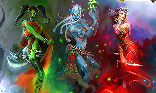
度:游戏深度内容与友好度之间的平衡点。
当我们完成游戏精华部份内容的设计后,总会首先面临这样一个问题:如何引导一个新手玩家成为一个资深玩家来适应和接受这些内容?在WOW里,我们使用升级曲线这个方法来完成。
每当我面试来应聘的新设计师时都会问一个带点儿小陷阱的麻烦问题:你认为WOW为什么能取得成功?当然,这个问题所隐藏的会让我满意的答案之一就是升级曲线——如果你把它拉得太长,会成为一个玩家升级的障碍——平衡点很重要。我们的游戏让玩家在升级上所花的时间要少得多。(译者注:我再一次强烈鄙视某些韩范儿网游那数都数不清数字的经验条和长长的升级之路...)
另外,长度适中的升级曲线也会起到鼓励玩家练小号的作用。在WOW测试阶段就有一周即可练到60级的玩家,他们的出现着实让公司内部产生一些忧虑,担心由于满级而会造成用户流失。但我告诉我的同事们“随他们去吧”,我们的游戏并不是只为这些人而设计的,当到达满级时,他会有更多的时间去体验游戏中我们设计的那些核心/精髓内容和玩法,或者练其他职业的小号,这不都挺好吗?如果你因为这些人而把游戏的升级过程设计的漫长曲折,也会让那些喜欢尝试别的职业、天赋的小号控们望而却步。(译者注:我认识的所有WOW妹子几乎都是小号控,她们的每个小号都有美丽的外表、漂亮的各种裙装和一大堆的宠物、坐骑和玩具,WOW真应该给所有女性玩家都颁发一面锦旗啊!⊙o⊙)
另外值得一提的是双倍经验系统,比起内些疯狂的24小时不下线的高玩们,我们给那些每周只玩儿4-5个小时WOW的休闲玩家们设计出休息奖励政策,他们可以通过不在线的“角色休息时间”来累积双倍经验,并更轻松的享受练级过程。
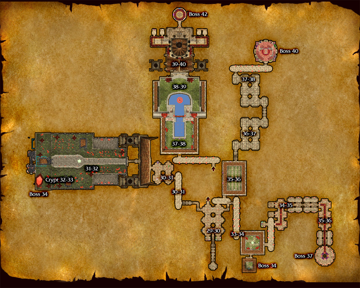
无心插柳柳成荫:著名的血色修道院四门制。
血色修道院的四个分支副本模式让玩家更喜欢选择去打“狗男女”或者刷“武器库”,这个行为也使我们发现了游戏内容的时间合理性及其对于玩家而言的重要,比如30分钟,或者吃顿午饭的功夫是最合适的。所以我们在数据片中加入了更多的“分支副本”,即把一个完整的副本分成几个不同的区域供玩家进行选择,你们可以在半个小时左右打通他们其中的任意一个。如果把副本设计的过于复杂庞大,除非闲的蛋疼或者有足够的时间经历,否则玩家可能无法完整地体验到其中的所有内容。(译者注:我表示60级年代里对于黑石深渊这个副本我一直怀有咬牙切齿般痛苦的迷路回忆...)
别怀疑,关于战场的设计其实我们主要是针对那些为了玩儿《反恐精英》或《战地1942》而废寝忘食的家伙们(这是腹黑的他说的一个冷笑话ORZ。)。
专注于精华和特色:这意味着不要盲目追求大而全的花哨玩意儿,而是集中精力做点真正牛逼的东西出来。
WOW里最好的例子是职业系统。很多游戏都有种类繁多让人眼花缭乱的职业,而我们在设计WOW的职业时则会尽量避免不同职业出现相同之处,使每个职业都能与众不同。所以在魔兽世界里,每个职业都拥有自己独特的法术、技能和玩法,而不是去研究什么红色治疗链、蓝色冰箭、绿色圣光术之类糊弄人的东西,即使是两个都带宠物的职业:术士和猎人,他们的宠物在游戏中的作用和玩法也是截然不同的。
最近我们宣布在新的资料篇里,联盟和部落都将同时拥有萨满和圣骑两个职业,这样做的一个主要原因是,如果我们为了PVP的平衡而将两个职业设计的同质化越来越严重,使他们失去各自职业的特色。为了避免这个问题,让两个阵营各自拥有一个特色职业这事儿也显得并不那么重要了,所以联盟有了被先祖“忽悠”的萨满,而部落有了拥有圣光之力的圣骑士。
游戏中的职业种类并不是越多越好,如果一个游戏中包含有过多的种族和职业,玩家们就无法了解每个职业的特点。我们的职业系统设定想要达到一个结果:当你看到一个你不认识的玩家时,可以通过他的职业、天赋和种族了解到他在这个队伍中发挥怎样的作用,尤其是在战场里,你还要在很短的时间里通过对敌方职业的判断来做出应对。如果职业过多而且你并不了解它们,那么就算你是个八爪章鱼,也无法违背公用CD在几秒钟内使用出无数种攻击/防御措施。
WOW的职业原型来自《魔兽争霸3》,我们的设定是将多个英雄的技能和职业结合起来,比如战士就融合了山丘之王、剑圣、牛头人酋长几个英雄的技能特色,这也同样是根据“专注于特色”的原则来做的。
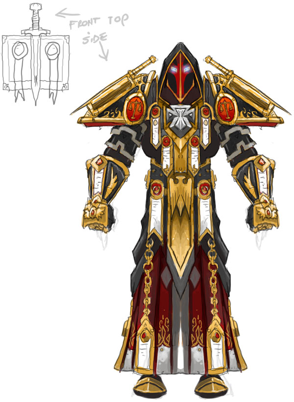
平衡性的權衡與取捨:游戲裡的每一項內容都與它有關。
遊戲設計師都是“貪得無厭”的,他們都會希望自己的遊戲老少皆宜全家齊上陣,所以我们游戏的价值观里并不存在绝对的黑与白,而是相对中立的(比如部落不一定代表正義的一方),尽管部落和聯盟的玩家都经常表示非常不满,但我們會一直堅持這個原則保持我們在對待兩個陣營時態度的平衡性;再比如我们對副本難度的設定使該級別玩家無法单刷副本,你想啊,如果一个副本可以让一个职业SOLO,那么组队去副本的其他玩家就会感到他们的付出没有价值,找不到存在感是一件多麼鬱悶的事情啊!(≧▽≦)
另一个平衡性的例子是關於運行WOW電腦的硬件配置要求。《孤岛危机》的画面效果非凡,但卻把許多低配置電腦拒之門外,而WOW則選擇了更大的主流配置機市場上。我们把精力放在艺术风格的体现上,使它们不会显得过时,图形工程师们則付出最大的努力把遊戲画面做得尽量漂亮,雖然这种妥协确实让我们饱受批评,但我们早已经习惯了喲。实际上这种平衡的好处是它能获得更大的用户市场,并且开发者能够把精力更多地放在开发高质量的内容上。順便說一句,如果你选择《孤島危機》,你更多的是每天在与遊戲图形工程师們做不懈的斗争。
艾澤拉斯世界的大小与交通工具的矛盾也是需要平衡的一点。拿魔兽世界和暗黑系列相比较,我们自然希望整個地圖越大越好,让玩家看到史詩般宏偉的壯麗景色,但这样也使玩家在遊戲初期的各個地图間疲于奔命,感到非常厌烦,他們將WOW戏称之为《“长跑”世界》(World of Walkcraft)。于是後來我们设计了空中航线以保证玩家在遊戲時更方便快捷的旅行,并设计了一些受限的传送法术(譯者注:親兒子,開門呀!),使玩家能够更方便地在没有飞行航线的地区来往。
從另外一個角度來看,傳送門類的技能能夠给玩家带来更多交流和認識的机会,这不正是网络游戏所必備的社交系統的一個體現嗎?至于玩家是否愿意通过加强与人交互以便自己更便捷地旅行,也是一个需要认真面对和权衡的问题,但无论如何玩家都希望更方便地进行游戏不是嗎?
另一个需要平衡性的例子是關於装备的帥氣與否和个性化之類的比較。玩家们希望我们可以設計出類似《网络创世纪》中的裝備染色劑之類的有趣玩意,但实际上在遊戲開發階段,给设计团队做装备设计的时间確實有限,所以我们还是遵从“专注于特色”的原则,放弃了那些可能看来很炫的东西。虽然这个平衡调整的结果是在WOW里我們无法实现让每个人都显得与众不同或獨具創新,但通過高玩們希望通过絢麗的装备來顯示自己的付出和成就的要求,我们将最好的装备放在團隊副本,这样你就可以輕易地“以貌取人”來認出那些牛B人士們。要知道,如果你什么都想要,那你很可能什麽都得不到。(譯者注:翻譯到這裡有點惆悵,比起我那根祈福或者紅龍盾,似乎在後來一段時期內WOW的裝備設計顯得沒那麼認真了,不過下個版本的裝備幻化系統還是挺讓人期待的。)
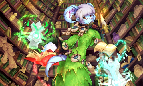
“暴雪式的千锤百炼”是经常被公司内的高管们提到的一个词,代表的是暴雪对游戏精益求精的态度,从这个游戏项目开发起开始就一直贯彻于始终,特别在项目进行到中后期时,“千锤百炼”这个词几乎与我们游戏的复查、修改工作绑定在了一起。暴雪游戏产品都能取得成功的原因,主要就在于通常我们会花6-12月的时间来对产品进行最终的修改、调整甚至回炉。
企业要有一个自我批评的文化特色,所有人都要恪守这一原则并不厌其烦地强调、执行和重复。如果你不重视它并任其滋生繁衍,那么你的产品就会很难有所改进和提高,当你抱着诸如“这只是个小错误,犯不着这么费劲地去改动”等不负责任的态度去工作时,一个你浑不在意的小问题,可能就会引发无数个玩家们都会介意的大问题来。
“精益求精”是从设计阶段就要秉持着得观念。随着近几年暴雪公司的高速扩张,我刚进入这行时只有寥寥数人的情景不复存在,每天都会有更多的人才加入我们并一起工作,这是一件非常有趣的事情,因为他们带来新奇的点子和创意,并用高强度长时间的工作来证明自己的能力。每当这时,我们会要求他们慢下来,请他们必须学会在团队中与其他人进行交流、分享、讨论以及合作,以吸取更多的经验和教训来完善自己的每一项工作。举个例子,我们在进行策划会议时,就会尽可能多的考虑到方方面面的内容,比如是否可以用在团队副本中?对PVP有什么帮助?新玩家能否适用?视觉效果如何体现?如何操作使用等等。多多征求他人的意见,收集和找出更多与众不同的点子并加以实现吧!(译者注:这家伙一定是个节日控或者成就控..)
第二步,当我们打算开始设计某样东西时,我们最先考虑的是其可玩性。以北郡修道院为例,如果根据地图大小来判断,我们在这里花费的时间要比其他地图多很多,比如职业训练师应该放在哪儿,玩家的战斗体验如何等等。在游戏性得到保证之后,我们才开始尽量扩大地图的尺寸。在我们明确为什么建造这个区域以及这个区域的游戏可玩性到底在哪里以前,我们不会一开始就规划好整个区域。相信我,如果等设计好一大块地图以后再开始根据游戏可玩性进行重做的话,你真会崩溃的。
当我们在开始WOW的初次亲友测试时,玩家们都惊讶于北郡修道院这个新手村是如此的简单易懂、容易上手且非常好玩。按照这个逻辑和方法,我们继续打造了10到20级、20级到30级甚至更高的游戏内容。设计中最重要的环节是追求创意,而不是墨守成规的机械性工作。
必须提及的一点是,游戏中的操作性至关重要。游戏的操作系统设置很多时候并不被重视。我还记得当年测试War3的时候,我发现鼠标和屏幕上光标的移动稍稍有些延迟,我几次向程序员提出这个问题,但他一直说都说没啥问题啊。最后他写了一个测试鼠标的程序,我们同时控制鼠标进行移动,最后发现它与光标移动间大约有三帧左右的延迟。也许你不认为三帧的延迟是多大点儿事儿,但当你的游戏玩家有可能因为操作的不流畅感而放弃这款游戏时,开发者们根本无法知道他们离开游戏并成为流失用户的真正原因。
小心返工。这是一张计划出现在早期游戏版本里的副本图片,但现在我们只能等到下个资料篇再发布了,原因是负责这部分内容的设计组一直与其他部门间没有任何的联系,处于真空状态。当他们完成整个设计来交差时我们才发现必须进行返工,这本应该是一个大型的团队副本,但内容完全不合格(译者注:原话是“这本应该是个团队副本,可他们设计的门太窄了!”),所以他们只能推倒重来,花三个月的时间重新设计。
最后,在游戏中加点儿笑话或者彩蛋,把你的快乐和好心情融入整个游戏中。如果开发者享受着游戏设计时间所带来的好心情,那么玩家在游戏的过程中也必然能体验到这种快乐。
第三步:冲刺阶段。游戏评测小组在暴雪内有着悠久的历史。我们从各种团队里抽调开发人员,组成一个包含各种类型玩家的混合团队,比如那种只RTS但从来不碰MMO的家伙。(译者注:游戏评测小组制度在游戏立项和完成阶段会对游戏的开玩性和市场前景进行评价和测试,如果不合标准甚至会被取消开发或要求返工,是暴雪游戏设计工作中很重要的一环。)
当然也不要在评测过程中把一些小问题扩大化,尤其是那些新手问题。早期我们曾经让测试者们组队进入了一个对他们当前等级而言要求偏高的区域,结果他们自然碰得灰头土脸。所以我们在对反馈意见进行评估的时候要问很多问题,尽量把事情搞清楚,以免好的设计扼杀在评测小组反馈来的问题名单上。
BETA测试对我们来讲主要目的并不是发现bug,也真不是收集玩家对游戏的反馈,而是进行技术上的压力测试和观察玩家的游戏行为。我们鼓励测试者们把游戏翻个底儿掉。在我们实时战略类游戏的BETA测试里,玩家通常对我们的天梯比赛满腹怨言,但是我们可以从排名上发现那些经验丰富的高端玩家,从他们那里,我们可以获取高端玩家的游戏方式、冲关经验等极具价值的信息。
俗话说的好,心急吃不了热豆腐,在一切准备就绪之前不要盲目行动的原则并不仅仅适用于网络游戏。如果将一款粗制滥造的游戏放在玩家面前,那对开发团队来讲必然是一场灾难,玩家和投资人都可能会因为这款游戏对你大失所望,严重的话今后五年内你的产品可能都会受到影响。即便你在发行后对游戏进行修补和改进,玩家们也不会耐心再次体验你的游戏。所以我们真心希望发行商们能够给开发团队足够的时间以保证产品的最终质量。(译者注:Rob Pardo最为让人传诵的一句话是“我们这家公司之所以成功,就是因为我们开发什么游戏不是由商人决定的,而是由开发人员决定的。”暴雪的产品虽然饱受跳票的诟病,但是另一方面也反映出其对产品品质的重视和不妥协的精神。)
我希望我们能把暴雪对游戏制作千锤百炼般精益求精的态度作为一个值得我们自豪的标志。在这个时代里,与其他类型的游戏相比,网络游戏有许多与众不同的地方。今天,它已经成为游戏开发的前沿阵地和一片广阔的蓝海市场,所以暴雪会继续进行更多方面的尝试,推动这一类型游戏向前发展!
附英文原文如下:
What Really matters: how Blizzard Game philosophy translates into World of Warcraft
We have a set of core philosophies, and I will talk about how we apply them to WoW.
We have a lot of mantras: 'concentrated coolness,' 'easy to learn, hard to master,' etc. With many designers it's important to have those shared values.
It all starts with a donut. Allan Adham (original designer & founder at Blizzard) would draw a donut to explain what Blizzard is about. The middle of the donut is the core market. The casual market is the rest. We see Blizzard as being about both, and that the casual market grows faster than the core.
A chief way of doing this is through system requirements.
Easy to Learn, difficult to master is the first Law. Design in the depth first, the accessibility later. A lot of folks seem to approach this the other way ' when we first develop our games, we first try to come up with the really cool things that add year sof replayability. Then we start talking about accessibility afterwards.
In WoW, we early on talked about character classes. One of the most important things you can do in a class based MMO is the combat system. So we tried to make the combat classes as unique and different from one another as possible. Dungeons too, we wanted them to be a much more hardcore experience, we wanted only groups in there, and so on. The dungeons are there to serve more of the cor e market. It's something to strive for, a bridge for the casual players to become a little more hardcore.
PvP was another big depth decision. All of our games have been online competitive games. Early on, we didn't know how honor would work, whether we would have achievements, but we knew we needed PvP Alliance vs Horde.
Lastly, we knew that raids and end game had to be there. We all played UO, EQ, we led uberguilds. We wanted encounters more like you see in Zelda, scripted encounters.
After that, we started talking about accessibility. Which starts with the UI. One of the first pitfalls with UI is trying to make everything visible from the UI. We try to streamline the UI, present only the stuff that is important. This is why we made the auction house accessible via an NPC, rather than via the HUD.
System requirements is another huge component of accessibility.
Another thing we talked about very early on was the game being soloable to 60. We really wanted it to be available to everyone. If you just wanted to play like a single-player game, you could do that,but you'll see dungeons, battlegrounds, people with cool gear, and so on. We saw this solo game as our casual game.
We also spent a lot of time on the newbie experience. First and foremost, it's not overwhelming. We generally shy away from tutorials. I enjoy games like Prince of Persia and God of War, which ease you into the game. That's the approach we take as well. We drop you right into a newbie zone, and it's not overwhelming. You're not in a huge confusing city. The newbie experience is not finding your way out of the starting town.
The newbie zone also gets you right into the action. Everywhere you look, there's a building or two, a couple of NPCs, and monsters. Within five minutes of starting up, you can fight monsters.
Exclamation point design: a game completely driven by quests. We wanted you to always have a reason for existing, a story. The exclamation point design is something we first did in Diablo II. Even the most casual players click on the guy with the exclamation point that is right in front of them, get a quest, and are off and running.
Killing with a purpose is the quest philosophy for WoW. With other MMOs, quests were just go out and see that experience bar move. Getting another bubble of XP is really fun but no accessible. We thought that giving you a reason to kill things was more accessible. A lot of people criticize how many bounty or collection quests are in WoW, but it came out of 'killing with a purpose.' This way you are always moving around the world, seeing different things in your combat.
Clear concise objectives: try to provide all info in the game, don't drive players to websites. We try hard through our quests what you need to do, where to go, where the quest giver is so you know where to go back to. Every time we bring in a new quest designer, they want to do a 'mystery quest' that has vague information, but the reality is that the player will just go to Thottbot, and the people who don't do that are the casual players who are the ones you need to handhold!
Don't make players talk to every NPC to find a quest. We try to make it easy to find the quests, a menu of options for things to do. There is a side effect, what we call the Christmas tree effect, which is too many exclamation points overwhelming the users. There's a balance between too few and railroading, and too many.
Give players a menu of options, but with a limit of 20. Raising the cap on the number of quests is one of the most common requests. We do have technical reasons not to, but the real reason is that the bigger the quest log gets, the less you feel like you are on a mission to do something. If you vacuum up the quests, and then kill indiscriminately, you are probably doing one of them. So putting in a limit makes people make some decisions.
Quest designers are 'the cruise directors of WoW.' Their job is to show you the world. When we first do a zone we talk about POIs, points of interest, how many of each type of quest, and that's the job of the quest designer. Different people like different kinds of quests. So we have to give you a list of possible entertainment to choose from.
Pacing: the bridge between depth and accessibility. Once you have all those deep features, then you have to figure out how you get from the newbie experience to that core experience. For WoW, that's done through the levelling curve. When I hire designers for Blizzard, one of my pitfall questions that I ask is 'why do you think WoW was successful'' One of the hidden answers is the levelling curve ' if you extend the levelling curve too far, it becomes a barrier. You hit a levelling wall. Our walls are shorter and there are less of them.
The short levelling curve also encourages people to reroll and start over. We had some hardcore testers who would level to 60 in a week. There was much concern within the company. But I would tell them that we cannot design to that guy. You have to let him go. He probably won't unsubscribe, he's going to hit your endgame content or he'll have multiple level 60s. In games with tough levelling curves, it discourages you from starting over.
Rest system also helps with the casual player who plays 4-5 hours a week. The hardcore player will keep the game in 'no rest' state the whole time, whereas casual players will get rewarded for weekend binges followed by days off.
Bite-sized content: we try to tune our quests for accomplishment in chunks. We aim for a 30 minute session, lunchtime battlegrounds. We are doing more 'winged dungeons' in the expansion, because we kinda stumbled upon it. We split up the dungeon into separate wings that can be done in 1/2 hour to an hour ' like Scarlet Monastery. This was a lesson we learned during development, so we weren't able to apply it everywhere in the original release. You want to avoid getting to a place where the content of your game doesn't allow people to play unless they have X amount of time that night.
We aimed battlegrounds at the folks who over lunch would play Counterstrike, or Battlefield 1942.
Concentrated coolness. What this means is, rather than make variety and lots of things to do, make fewer things really cool. The best example in woW is the class system. Lots of games have more classes, multiclassing, etc. We consciously avoided that in order to make each class as cool and different from the others as possible. This allowed us to have unique spells, abilities and mechanics. No red fireball, white fireball, blue fireball, etc. Even the two pet classes, hunters and warlocks, use their pets completely differently. We consciously avoided sharing mechanics across classes. We recently announced that the paladins and the shamans are switching sides. One of the primary reasons why we undid that rule was that we found ourselves merging them into each other for PvP balance. So we decided that it was less important for each side to have its own class than it was to have concentrated coolness for each class.
More classes are not always better. Once you get enough different units or classes, players can only handle so much. When you see someone, you might not know what they can do, and this matters because when you want to form a group, you lose track of the strengths and weaknesses. In battlegrounds, you need to know instantly what the opponent can do to you. Even if you have 50 completely different ideas that are cool, it's still important not to use them all.
Our class ideas originally came from Warcraft 3. What we chose to do was to take the heroes and combine them. Warrior got aspects of mountain king, blademaster, and Tauren chieftain from War3. We chose to concentrate the coolness.
Tradeoffs. Every decision comes with tradeoffs. designers are greedy by nature ' we want everything, moms, dads, cats and dogs playing together. Nothing in game design is black and white, it's all shades of gray. Whenever we can, we try not to compromise. It usually results in both sides being dissatisfied. If we had solo dungeons, then he group dungeon fans would feel their achievements would be cheapened. So we chose specifically not to have solo instances.
An example of Tradeoffs: system requirements of Wow versus Crysis, for example. Crysis looks awesome. But we would rather have the broader market. So that forced us to the stylized art style that is resistant to looking dated. It did generate lots of negative press, and our graphics programmers always wanted to push farther too. You just have to be prepared. But every game we've released, we have gotten the comment that our screenshots were not up to par.
There are benefits to the cutting edge side too. It's easier to market, and developers want to make the best quality art. You're fighting against developer psychology if you choose the other route.
World size vs teleportation is another. WoW vs Diablo. We wanted to the scale of the world to feel epic. But you get players getting frustrated and calling it 'World of Walkcraft.' You use flight taxis to maintain integrity and having limited teleportation means you can have remote areas where you consciously do not provide a flight path to it.
But on the teleportation side, you get a lot more social connectivity, which is what MMOs are all about. There's a barrier there if people have to travel and coordinate. We consciously decided to have that tradeoff. Players do want the convenience.
Another tradeoff is prestige gear versus customizable gear. Players ask for dyeing armor, all that. When I played Ultima Online I loved that. It was a great feature. But there's only so much art time you have, and we chose instead to concentrate the coolness on armor from specific rewards instead. The whole point for a lot of hardcore players is to show off your advancement. So we chose the best gear to be from raids, so we can recognize someone's achievements based on their gear. The tradeoffs is that you lose everyone looking different and users expressing creativity. And if you try to have both, you'll end up muddled and somewhere int he between.
The Blizzard polish. Polish is the word associated with us in reviews. There's this big assumption that polish is something you do in the end. That we're successful because we spend 6-12 months at the end polishing. We do get more time, but we do the polish right from the beginning. It's a constant effort. You have to have a culture of polish. Everyone has to be bought into it and you have to constantly preach it. if you leave it to the end, it'll be more difficult.
You'll get a lot of 'why does it matter that this feature is polished' It's so small.' But people notice 1000s of polished features, not the single polished feature.
Polish starts in the design process. (pic of skeletons in a room, which he says is the designers in a room). We're kind of in a new era at Blizzard, when i started we had very few people with the title game designer. That's been changing over the last few years. It's interesting bringing in an experienced designer from outside, because they want to make a unit week, add a mechanic constantly, work 100 miles and hour. We have to get them to slow down. You need to talk through things with everyone else, and you have 100 features and they all have flaws and don't work with each other. So when we are in a design meeting, we try to consider everything. Will it work in this raid encounter, in PvP, as a newbie, for the art, solid mechanics, etc. Contrary to popular belie, we do consider production. Mounted combat is an example of something killed by production time. Bounce ideas off everyone. Let the beer goggles wear off.
When we develop maps, we do it on the whiteboard, so we can iterate, and there's no cost to changing things.
Phase 2 is when we actually make something. The first thing we try to do is make it fun. Northshire valley, for example ' we spent an inordinate amount of time on it. Where do we put the trainers, how does the combat feel, etc. We probably spent more time on it than any other area, by an order of magnitude. After we made it fun, then we made it big. We didn't go out and build the entire world of WoW until we knew what we were building. It didn't make sense to do that until we had figured out all the details of the fun. If you have to retrofit the fun into the content, you're gonna be screwed. When we went into the friends and family alpha test, people were surprised that it was fun. It was a lot easier, once we knew what was fun, to do levels 10-20, and 20-30 and so on. The design at that point was creative design, not mechanics.
Control is king. Game control is taken for granted a lot of times. I remember on Warcraft 3 I could feel a little bit of lag on the mouse cursor, and I kept saying it to the programmer, but he kept saying he couldn't see anything wrong. Finally he coded in a hardware cursor so we could run both cursors at the same time, and lo and behold there were three frames of lag. And that matters, it's important. People will leave over that, but you'll never know that is the reason.
'Beware of the Grand Reveal.' This is a pic of a dungeon that was supposed to be in the original release but is in the expansion, because the subteam went off to work on it in a vacuum, disconnected from the rest of the team. The grand reveal was when they came back and showed it. It was supposed to be a raid dungeon but the doors were too narrow. So back to the drawing board it went, three months of redo because we didn't redo along the way.
Lastly, have fun with the game. Put in the little in-jokes. If developers are having fun making the game, chances are the players will have fun with it too.
Phase 3: the finish line. Feedback strike teams is something that we have used for a long time. We pull devs from all the teams and put together a diverse group with a mix of play styles ' RTS guys who don't like MMORPGs, etc.
Don't take small decisions for granted, especially in that newbie experience. We had cases early on where people grouped up with 1 other person that they would get into the next area at 4th level, and that meant they had a bad experience. So we try to ask a lot of questions and don't let things die on the feedback and striketeam list.
The beta test for us is not about finding bugs. It's not really about getting a lot of game feedback. it's about stress testing from a technological and gameplay level. We encourage our testers to exploit the hell out of the game. In our RTS beta tests, people always get upset that we run a ladder in the beta test, because the guys on top are exploiters. But that's the point ' we want to see who the top ten exploiters are so we can look at their games!
Don't ship until it's ready. This matters even more with MMOs. You might hear that it's improved later, but no one actually goes back to try it. You will really cripple yourself, you put at risk the next five years of your product. So hopefully all you publishers will give the developers more time.
I hope we turn this genre into something special. The thing I think is really unique about MMO games ' you look all the other genres, and the genre depicts a very specific type of gameplay. But massively multiplayer, this genre has the biggest frontier, it has the most we can achieve, and we should be pushing at all kinds of different directions.
| 欢迎光临 仙剑之十里坡 (http://palslp.com/bbs/) | Powered by Discuz! X2.5 |